Blood on Paper: The Art of the Book

Those of you in
I didn’t have much information before I received a copy so my immediate impression while opening it was with its elegant and beautiful construction. This “book” has an outer protective shell of heavy cardboard that unfolds to reveal a cloth covered box that has a nice typographic composition of the names of the artists debossed into the cover. The names are blind stamped (not foil stamped or inked) so they barely register against the creme color of the Brillianta cloth. What does stand out immediately is the blood-red hot foil stamped title.
The top cover of the box sits snugly closed over a bottom tray that does not allow the two linen boxes to meet when closed -- instead they stay slightly separated to allow a bit of the red inner tray to peek out through a crack, thus repeating the blood motif in an interesting yet simple design construction.
Once the cover of the box is removed there is a set of 41 loose folded leaves, each of which are dedicated to one or two books from each of the 38 artists featured in the exhibition. These folded leaves are wrapped in a linen cloth to assist lifting them out of the box undamaged. The leaves are printed on heavy weight 250 gsm matte paper and the printing is exquisite.
As I mentioned before each of the leaves is dedicated to one artist who is named on the front page and whose book is shown over the other 5 pages. (Each leave is basically a long sheet of paper folded folded twice to create three pages to a side -- six pages front and back).
The list of artists featured comes across as a who’s who of the twentieth century’s most famous. Bacon, Balthus, Baselitz, Beuys, Bourgeois, Buren, Bustamente, Cai Guo-Qiang, Caro, Chillida, Clemente, Dubuffet, Francis, Giacometti, Hirst, Iliazad, Kapoor, Keifer, Koons, Lecuire, Lewitt, Lichtenstein, Long, Matisse, McCarthy, Miro, Motherwell, Noguchi, Parr, Phillips, Picasso, Rauschenberg, Rego, Roth, Ruscha, Tapies, Tuttle, and Vital.
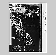
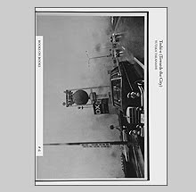
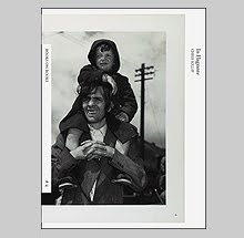
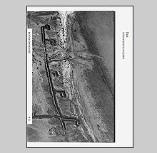
Most of the books featured, with the exception of a few, are very limited edition pieces. There is a facsimile suitcase full of reproductions of miscellaneous papers found in Francis Bacon’s studio (called Detritus) that is in an edition of 25. A unique book from Cai Guo-Qiang of drawings made with gunpowder mixed with paste that has a tempting string dangling from its edge that when pulled ignites the book. One of Damien Hirst with the pretentious title: I want to spend the rest of my life everywhere, with everyone, one to one, always, forever, now. A book by Anselm Keifer which stands vertically at 7 foot tall with pages made of lead covered cardboard called The Secret Life of Plants. Martin Parr’s contribution is of his Benidorn Album of 40 photos in plastic sleeves. Picasso’s Deux Contes is a book of 4 dryprints with a text by Ramon reventos that is housed between two carved pieces of wooded board bound by maroon fabric ties.
I could go on as much of this is pure eye candy for designers and alternative binding techniques etc -- but after a looking through all of this great material I started to realize just how thin the information about each book really is. All that is written about the individual books is simply their technical specifications (size, material, printing technique etc.) and almost nothing is written in regards to the content. ‘OK,’ I thought, 'the illustrations will show enough to get a sense of each book.' Think again. The illustrations show very little of the books actually. Most include a couple of images of the content/artwork, a photo of the cover or case of the book, and then much space and energy is given to extreme close-ups of the edges of the pages or a bit of embossing that -- although they look great -- they do little to inform.
This is the major missed opportunity with Blood on Paper. It is as if the producers of the book became so tied up with the elegance of the presentation that they took their eye off the informative aspect of this catalog. It wouldn’t have taken much to make this near perfect either. That is a real shame because each of the folded leaves is approximately 11.5 X 11.5 inches -- which is a lot of space to have available for illustrations. I might have suggested including many more photographs of the interiors of the books instead of just one or two photos that really just amount to being graphic elements.
Blood on Paper: The Art of the Book is co-published by the Victoria and Albert Museum and the Ivory Press, the company behind C International Photo magazine/books and other limited edition artist books by artists included in this exhibition and catalog. Elena Foster and Rowan Watson are the curators of the exhibition and each offers a short introductory text to this catalog.
As many of you know I love books on artist books and it is really difficult to not enjoy most of Blood on Paper. The packaging and even the strong smell of the ink that wafts from the box entices me, but when it gets down to the bare essentials, I need to be able to see the blood we have heard so much about.
Book Available Here (Blood on Paper)
![]()